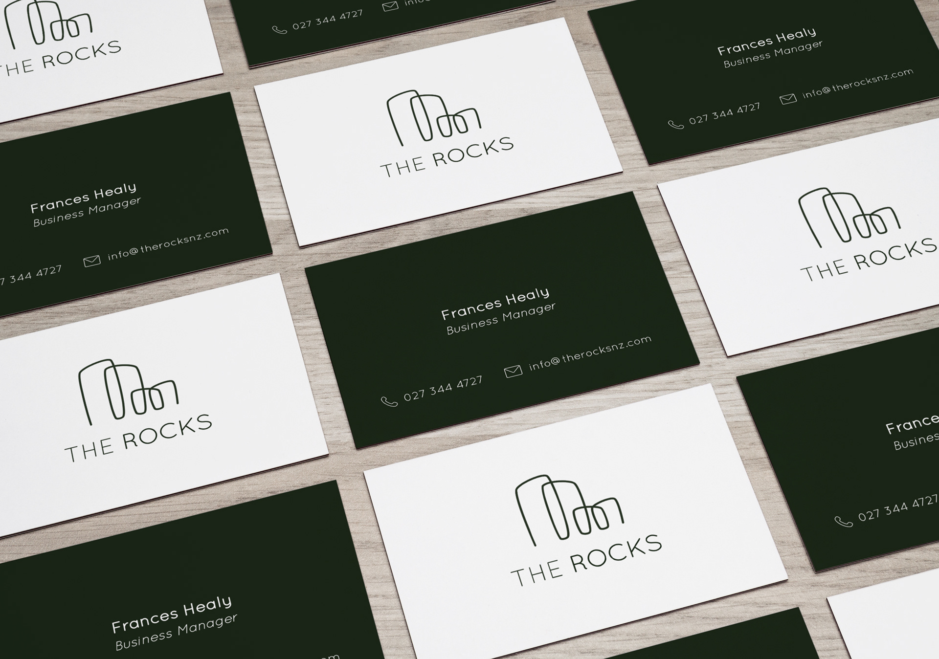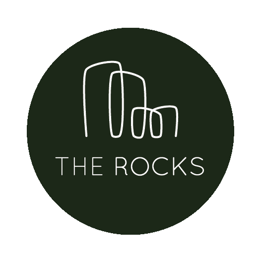
The typeface of this logo supporting the contemporary, minimalistic design with a heavier weight to be cohesive and uniform with the weight of the design element.
The word “Rocks” has been highlighted with a thicker weight to emphasise the design element and standout as the core business attraction to the viewer/audience. I have chosen a deep
green so that the there is still a strong contrast when against lighter busier backgrounds.
The word “Rocks” has been highlighted with a thicker weight to emphasise the design element and standout as the core business attraction to the viewer/audience. I have chosen a deep
green so that the there is still a strong contrast when against lighter busier backgrounds.